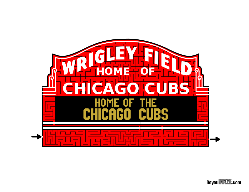
I used to make a lot of sign mazes. Not so much anymore. I enjoy making them, but most of them are ignored. Except the famous signs. Some of those are ok. Which brings us to the Wrigley Field Sign Maze. It is a simple maze, and I made it in color. Looking back, I don’t like that it is floating on the page. So I am updating it. Here is the original post:
Maze of the Week #23 - Wrigley Field Sign Maze
Here are the enhancements I made to improve the maze:
1. Changed the Start/Goal. I switched start and goal to internal - with words instead of arrows to allow me to work on the outside portion of the sign.
2. Added the Background. I added a background, including the base of sign that holds it to the stadium, windows, stadium pillars, and fencing. All of this to give it a more realistic look and stop it from floating on the page.
3. Added Texture. I gave the concrete portion of the stadium some texture to make it look more realistic.
4. Maze resized. I changed the maze to be 11.5 x 7.5 vs regular letter size. It looks better.
5. Branding Changes. I moved the branding into the window and switched it to vertical to integrate it into the maze more. I also changed the branding to white from black.
6. Sign message change. I changed the message on the sign, and added lights that are out for more realism. “Home of the Chicago Cubs” is permanently on the sign - no need to repeat it.
7. Background details. I added bolts onto the steel beams to show more detail and I added blinds in the windows behind a see through windowpane - they are hard to see without zooming in.
Let’s check out the before and after:


I think both mazes work, but of course I prefer the new one best !
Some data: The new file is 566MB from 24MB. Much bigger !
I will be replacing the homepage with the new maze going forward. You can find the maze download there !
If you like this type of content check out all of my case studies:
A Collection of Maze Design Case Studies to Improve your Mazes
Happy maze-ing !

