
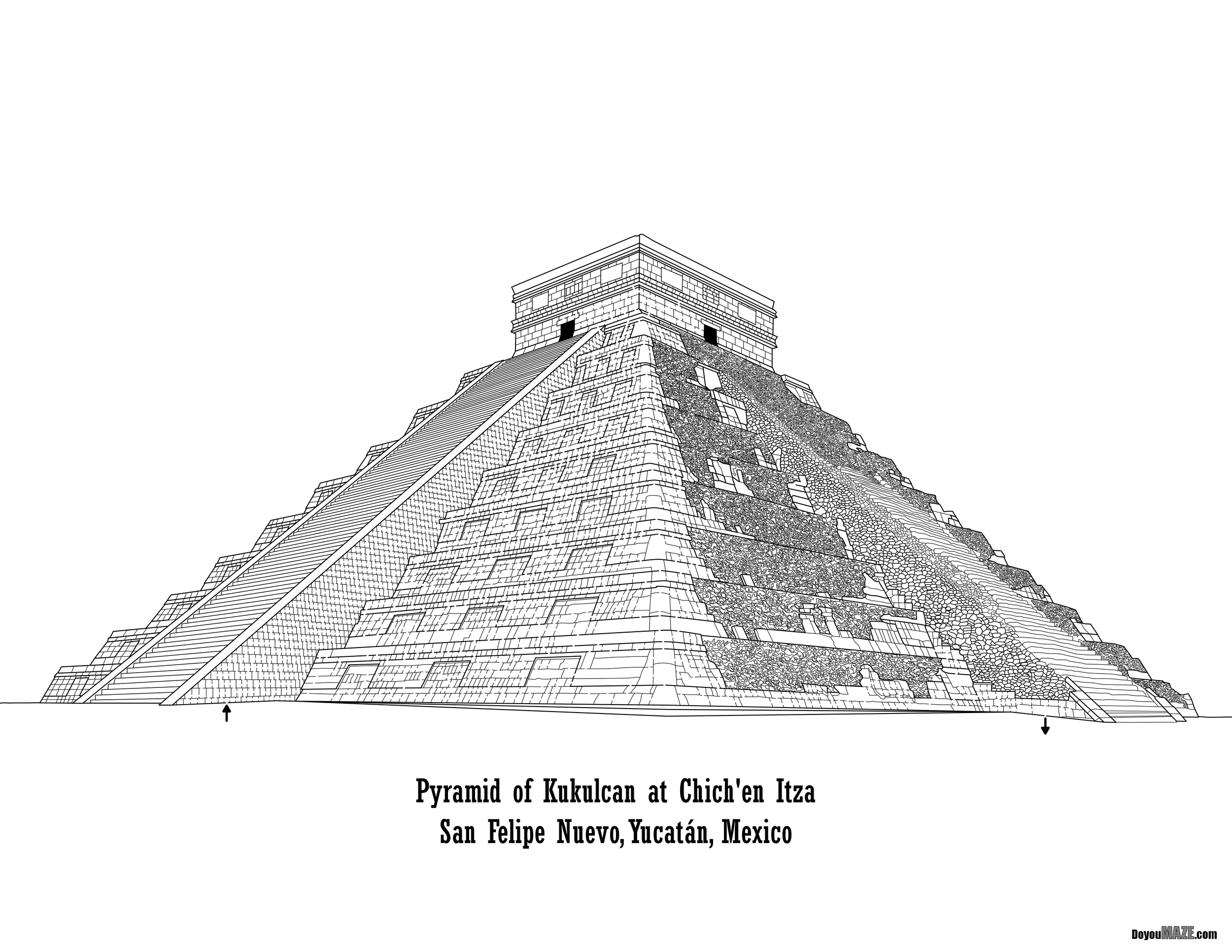
The first version of this maze is one of my favorites, but since then I have learned how to use new techniques I wanted to make a few changes and see if it improved the maze. Also, while the original version was a traditional black and white maze look, which I liked - it was floating on the page a bit and I wanted to change that. Here is my original blog post:
Maze of the Week #49 - Temple of Kukulcán Maze
Here are the enhancements I made to improve the maze:
1. Changed the Maze size. I reduced the height of the maze from 34 inches to 25 inches to better reflect the contents of the maze and reduce empty space.
2. Recenter the Maze. Because of this I moved the pyramid down on the page.
3. Reduce the font. Reduce font of the location vs. the title because it looks better like that and focuses on the what vs the where.
4. Change branding size. I increased the size of branding by 25% to look more in-line with everything.
5. Background changes. Added trees and bushes on the horizon.
6. Added structure details. I Added moss to the top of the pyramid and down the steps to better reflect what you actually see.
7. Added shadows. Added to the pyramid, the steps and on the ground to give the maze more interest.
8. Start/Goal changes. Switched to an internal Start/Goal and changed the font to red color to be more visible (vs. black)
9. Added a sky
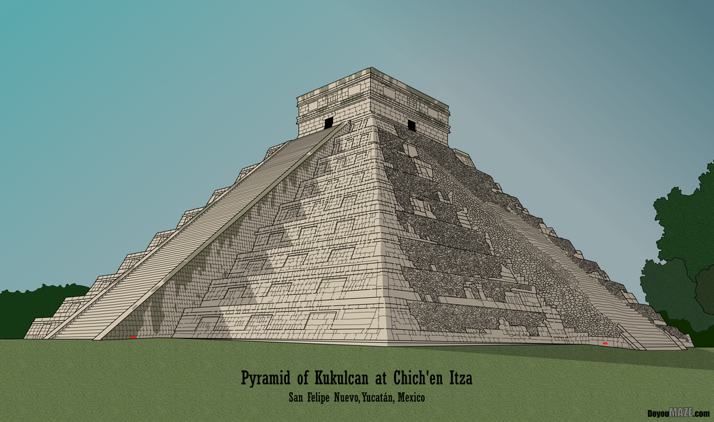
Boom goes the dynamite. Much better. This is why I go back to some mazes.
Some data: The new file is 761MB from 557MB.
I will be replacing the homepage with the new maze going forward. You can find the maze download there !
If you like this type of content check out all of my case studies:
A Collection of Maze Design Case Studies to Improve your Mazes
What I've Learned Making Mazes
Happy maze-ing !


