How to Make a Math Addition Trail Maze

Today I will share with you how to make a variation on the popular Math maze construction that I call an Addition Trail Maze. While a math maze can use dozens of different calculations to solve it, the addition trail maze uses only one, addition. Let’s define what I mean, then get into the example. First, here is my definition of the 2 types of Math Mazes:

Math Maze - A type of number maze where moving from the Start to the Goal is done by correctly answering math problems to move in the correct direction.

Addition Trail Maze - A type of math maze where you move from Start to Goal by adding numbers along the way (the trail) to hit a specific goal number.

How to Make a Math Addition Trail Maze

Step 1 - Draw the Outline

This maze type is not conducive to outline or shapes so I will use a traditional grid-like pattern to illustrate the creation. The outline I use in the example and the most common is a simple square or rectangle, although it can be made in any gridded shape.

Step 1.5 - Choose the Start and Goal

I like using a START and GOAL within the maze placed inside the grid. I choose opposite side of the structure.

Step 2 - Add pathway walls

Next I add pathways to create trails that will become the framework for possible pathways. This choice will determine what possible outcomes at available to you. Notice that I limit the options with a bottleneck between the 3rd and 4th columns. Although the grid I was working with is not shown, this is a 5x5 grid.

As a creator the next few steps happen as part of the design process, but will not be part of the final maze. They are planning steps to create a workable maze.

Step 3 (Planning step 1) - Break the trails into sections

Create sections (mine are in bubbles) which are options that can be moved to. I labeled them with letters. From the START you have 2 options to move in, into section A or into section B. If you move in direction A you will move through 4 blocks before making another decision. If you move onto B you immediately have another decision to make, D or E. When you make your sections for the first time you will make a mistake or 2. The most common mistake is including a block into a section where it does not belong. For example: If you are in A, you MUST next move to C, but C is not part of A. If you move from B to D you also MUST move to C, but C is also not part of D. C must be independent.

Notice that the bottleneck I mentioned in Step 2 is now labeled F and must be used in any solution.

Step 4 (Planning step 2)- Create a decision tree

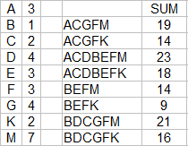
I made a decision tree to show the possible pathways that can be taken based on my maze construction. To make this easier to see I did not combine common branches i.e. each branch ends with it’s own FMK sequence instead of one common branch. This tells me that I have 8 possible trails to follow which are:

BEFM, BEFK

BDCGFM, BDCGFK

ACGFM, ACGFK

ACDBEFM, ACDBEFK

Step 5 (Planning Step 3) - Add numbers to the sections

Use the 8 possible solutions we found above and assign values to each letter which will create the 8 numbered solutions. Then convert those numbers into the appropriate section of the maze. If plug these into a spreadsheet I can write some formulas to calculate the possible answers. Here is what I used, and their answers:

I can adjust the numbers of each letter as needed to create different sums.

And here are those letters converted to numbers in the actual maze. I used all small numbers, but that is obviously not necessary:

Step 6 - Delete background items

Clean-up the trail maze and come to a final addition trail maze construction.

Step 7 - Add Directions

Add directions to explain to the solver how they can move through the maze. Because you have already made the solution tree in the planning process, this is the time you pick which solution will be the correct one. Because there are 2 possible solutions for 14 I did not pick that number !

Math Sum Trail Maze example

Addition trail maze

Step 8 - Create a Final Solution

Highlight the correct path in the final version of the maze to create the final maze solution (shown here in gold).

Math Sum Trail Maze example solution

Note that the final maze is a 5x5 grid, using 23 of the 25 blocks for possible solutions. Let’s look at an abbreviated example to see how a few changes effect things.

Additional Math Trail Maze Example

Here I am using a 6x6 grid and a different internal wall structure which is much more complicated. Going from 23 blocks to 34 blocks really gives us so many more options. We had 8 possible pathway solutions above, any guess how many solutions this maze will have? Here are the abbreviated steps to give you a sense of what I mean.

Steps 1, 2, and 3 Outline, walls, and section the pathways

I have combined the steps for brevity. The walls I used have more gaps and so this leads to more possible pathways. The number of possible sections in our first example was 9 (as shown by having 9 different letters) and here it is 18.

This can be seen in the decision tree below. I did the pathways for B before A. You see a full tree for B while A is abbreviated using those findings so we have a smaller tree to look at. The M, G and U that are colored on the B side of the tree is repeated for the A side, aligning to the colored m, g, and u. Circles reflect the goal. B has 12 ways to reach the goal, as does A, so 24 possible pathways. So that is our answer, 8 possible solutions become 24 with just a slightly larger maze size!

Here is the spreadsheet I made with possible solutions. With some formulas you can play with the #’s that correspond to each letter and see the possible answers change in real time.

Step 5 Add numbers to the sections

Yes I added some negative numbers into the mix. It adds a nice twist to the possible pathways and solutions. It gives the solver more strategy to use in how they move through the maze.

Steps 6, 7 - Delete guides and add directions

I chose 39 as my solution. But I should mention that choosing the largest number you calculate in your spreadsheet is also fun. The smallest number tends to be easier to solve and I do not suggest you use it unless you use many large negative numbers to hide the solution well. There is also some intelligent design you can use by making some sections look different than they may actually be (e.g. a large number followed by some small negative numbers to even everything out).

Math Sum Trail Maze example #2

So that completes the instruction. I hope you enjoy making your own Math Addition Maze !

Here is an early example I made (still called a Math Maze at the time) I am including so you can practice breaking the maze into sections. Good Luck ! The answer is immediately below.

Math Sum Trail Maze example #3

Let’s see how you did:

Other posts you may be interested in:

Mazes of all 50 US states for Kids, each maze includes the state capital, year of statehood, state motto and more.

A collection of free downloadable Kids Activity Books.

Step by step instructions on how to make over 40 different types of maze.

Instructions on how to make labyrinths.

Codebox maze generator review

Today we have a new maze generator to review. I think you are going to like this one because it has so much more functionality than most I have seen online.

I will be using the same format I have used for my review of the top maze generators and am adding this review to the main blog post. If you are not familiar with that post I will look at what shapes of maze are available, the cell types, size, choices to start and end the maze, is the solution given and can you download it. Let’s get to the sitereview.

CODEBOX

Shapes: 4+ : Square, Circle, Triangular Grid, Hexagonal Grid. While there are 4 main types you can also create an infinite number of shapes using the mask feature !!

Cell types: 3: Square, Hexagons, Triangles

Width and Height: 2 - 50 for squares and hexagons, Triangles from 4-85 width to 2-50 height, and circles can have 30 layers

Start/end: 4 choices: None, Top to Bottom, Left to Right, Hardest entrance/exit

Solution generated: Yes

Downloads available: Yes, as an SVG file.

What this site does best: Of all the sites I reviewed this is one of only 2 sites with Circular maze generation. It is also the site with the most flexibility in creating shapes. You can create a distance map that shows how far the point is from the entrance. The generator offers a choice of 10 different algorithms to generate the maze. You can also solve these mazes on screen using your mouse and keyboard. You can also choose to watch the maze generate !

Examples: Starting in the top left corner a simple 20x20 maze, a hexagonal grid maze, a circular maze, and a shape I made myself using the mask feature. I also suggest you check out the examples given on the site.

4 Codebox maze examples

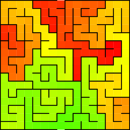
Finally here is a look at an example of a distance map. From the bottom entrance in green to the top exit in red (generally).

Codebox distance map example

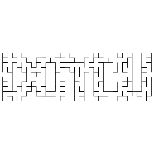
I couldn’t resist making a “do you” maze using the mask feature.

DOYOU maze from Codebox website

This is an excellent website for generating mazes. I recommend it.

How to Make a Mobile Maze

The 43rd type of maze construction I will “how to” is the Mobile Maze. Like some of our other mazes, most notably, the Kids Maze, this type of maze can look many ways and have many different constructions, but it is still has distinct characteristics to properly execute ! Let’s define what a Mobile maze is then get into the step by step instructions !

Mobile Maze - A Maze designed specifically to be viewed and solved on a mobile device.

HOW TO MAKE A MOBILE MAZE

Step 1 - Choose the Maze construction

This seems like an odd Step 1, but it is correct. Similar to a Kids Maze, the Mobile Maze can be created dozens of different ways. Take a look at the How To Draw a Maze section and choose the look you prefer. You will actually be following THOSE sets of instructions while following some basic rules to make the maze look good on mobile ! Also note that some objects lend themselves to this maze construction - a giraffe would be good, as would a anything long.

Step 2 - Follow the instructions + add these rules

Follow the instructions of the maze construction you selected while adding these 2 rules:

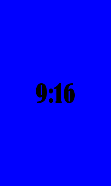
  1. Design the maze vertically using a 9:16 ratio or greater. The 9:16 ratio is the standard size for a mobile screen (you can read more about screen sizes below) . An easy way to think of this is that you want a maze about twice as high as the width. If you want a maze to be scrollable in order to be solved (this adds some difficulty !), try for a larger ratio like 1:4. What do I mean by that ? Well in a scrollable maze a dead end may be off the visible screen - in fact you might even design your maze with this in mind to make it more challenging !

9:16 ratio example block

WHAT A 9:16 RATIO LOOKS LIKE

2. Make pathways that are WIDE. This is a vague but important design feature. I find that a bit of testing is needed to get this just right. If you design digitally it can easily be adjusted (and this is for mobile, so I assume that it is) in order to have a maze that can be solved easily. For Grid based mazes (Grid Maze, Color Grid Maze, Arrow Maze, Block Move, etc.) the widest # of blocks I would suggest using is 5.


Let’s look at a few different Mobile Maze examples:

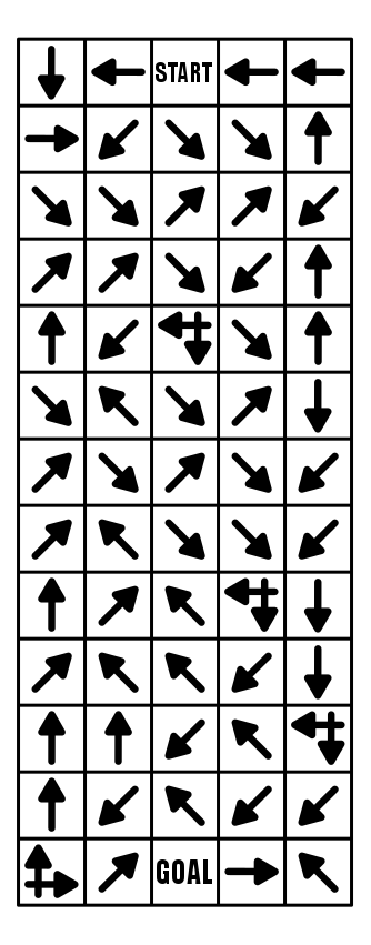
Here is an example of a Mobile Arrow Maze, that is a 5:13 ratio, and because it is an Arrow Maze, no pathway adjustments are needed ! Because the maze is long the solver cannot see the Goal when they start solving it !

Mobile Arrow Maze in a 5:13 ratio

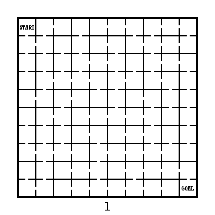
And here is an example of a Mobile Grid Maze. Once again I used a 5:13 ratio. Notice how the pathways between grids are much thicker than usual. I more than doubled the normal width.

Mobile Grid Maze in a 5:13 ratio

A Mobile Weaving Maze. 5:23 ratio, and with very wide pathways. I find that this construction needs more length than others to help establish more realistic false pathways. Still, this is a fun maze to make and solve in a mobile format.

Mobile Weaving Maze in 5:23 ratio

And one more for fun. A Mobile Hidden Message Trail Maze. 5:18.

Mobile Trail Message Maze in 5:18 ratio

ADDITIONAL MOBILE MAZE EXAMPLES:

I have a section on the site of over 30 mobile mazes, that includes a free downloadable file of each of them (not really a book since the sizing is for mobile phones, and not for printing). And, although it does not have many words, if you prefer to read and solve laberintos en Español, tengo que aqui.

MAZE DESIGN BASED ON SCREEN SIZE:

Computer screen monitors vary in their aspect ratio, but most since 2012 are 16:9 (1.78), although through time they have varied from 1.25 to 1.60. So, yes, you are not imagining things, computers are getting wider. Some of you might even remember when televisions were a 4:3 aspect ratio (1.33) before they became much wider.

Most smartphones also happen to be a 16:9 (in landscape mode or 9:16 in portrait mode) which is convenient when you use landscape mode to watch YouTube or other videos on your phone. But when you are not watching videos, your phone is in portrait mode for just about everything else you use it for. Tablets have large range of ratios with many 4:3 like an old tv and some 16:10. This makes them a bit wider so that books get formatted as a priority over videos (you are reading with your tablet and not watching movies right ?).

So, when I make a maze for this website I am always thinking about how it will look on a large screen and how it will print on a standard size piece of paper (8.5x11) which is a 1.29 ratio. The mazes still look fine on a cellphone screen, but are not entirely solvable in most cases without zooming in to see the pathways more clearly. This means a lot more difficulty in maneuvering to solve a maze.

So when you make a maze those are the screens you might be making them for. And in this case, Mobile mazes you want to design for a 9:16 screen !

OTHER POSTS THAT MAY INTEREST YOU:

44 Different types of Mazes and Labyrinths

Comparison of the Top 10 Maze Generation Websites

A Huge Maze of the Sydney Opera House

Maze Design Case Study - Designing a Grid Maze in Different Difficulty levels

I wanted to do a case study showing how to create a maze in a few different difficultly levels. I thought the best way to illustrate this was to design a create a maze with a variety of different branch types included then have you solve them and compare how enjoyable each was for you to solve. Let’s jump into the example and you’ll see what I mean. (Hopefully).

  • Example - Part 1. Please solve this small 10x10 grid maze. Yes this is an interactive example !

10x10 grid maze solving example

OK. Take note of how your experience was solving the maze. Did you enjoy it ? How quickly did you solve the maze ? Anything you did not like about the experience ? Did you find it to be enjoyable or frustrating ?

Now lets try this maze made on the same grid structure. We have 10x10 grid maze with the Start and Goal placed in the same locations.

  • Example - Part 2. Please solve this small 10x10 grid maze.

10x10 grid maze solving example 4

I have the same questions for you as before. How was your experience was solving the maze ? Did you enjoy it ? How quickly did you solve the maze ? Anything you did not like about the experience ? Did you find it to be enjoyable or frustrating ?

An finally in Part 3 we will group 2 additional mazes together for evaluation. Same questions will apply.

  • Example - Part 3. Please solve each of these small 10x10 grid mazes.

10x10 grid maze solving example 2
10x10 grid maze solving example 3

So what have we learned ? Before I go into some explanations on the design of each maze take a minute to hypothesize on what you think just happened. 4 similar mazes. Hopefully they gave you different experiences for you when you were solving them.

4 Maze Comparison - The Differences and Design Choices

  • First, did you notice each maze has the same exact solution ? Mazes 2 & 3 have the inverse (or flipped) solution of mazes 1 & 4. So the solutions are essentially all equal.

  • Each numbered maze should have gotten more difficult as the numbers increased (although with a small maze size this may have been somewhat less obvious)

  • Maze 1 - Short dead ends. Incorrect paths do not have branches. Pathways are wide. Some paths are “filler” and unusable.

  • Maze 2 - Longer dead ends. Incorrect paths do not have branches. Pathways normal width.

  • Maze 3 - Long dead ends with additional branches off of them. Pathways slightly smaller.

  • Maze 4 - Long dead ends with choices and branches off them. 4 way choices included. Small pathway widths.

So to summarize I used the following to change the difficulty of the 4 mazes:

  • The length of dead ends - How fast you know you have made an incorrect choice

  • Dead end branches - When you make a wrong turn are there multiple incorrect choices on that branch

  • Expanded pathway choices - Some intersections have multiple choices

  • Pathway widths - Smaller pathways are more difficult to see and navigate.

  • Unusable pathways - Filler sometimes used to fill a maze out while keeping it at the desired difficulty level.

Let’s look at the pathways coded to show what I mean. The red line is the solution. The blue line is the false pathway. The purple line is an unusable pathway (Did you know some mazes use this ?)

What you need to notice in the below deconstructed mazes:

  • Maze 1 - Thick pathways make this maze easier to solve. The purple lines to not connect to anything - essentially they are filler and unusable pathways. Most likely you did not notice them. They make the maze easier. The blue lines, the incorrect dead end paths - are short and only extend 2 levels before letting the solver know it was the wrong choice.

  • Maze 2 - Normal pathway width. No purple pathways from here on out. The blue lines are long but have no branches off of them. Longest length is 11 blocks.

  • Maze 3 - Pathways are a bit thinner. The blue dead end lines now have branches, so wrong turns have additional wrong turns. None of these, however has more than one additional dead end branch. There is also a dead end choice at the starting block.

  • Maze 4 - Pathways are very thin. There are now 3 intersections where 4 pathway choices are included (they look like a plus sign in this grid maze). Dead end branches also have multiple dead ends off of them.

four 10x10 grid maze solving example solutions

Hopefully this explanation and example shows you a small piece of how maze difficulty can be designed and changed with a few different choices. Most solvers would prefer Maze #1 because the wrong turns are not overly punishing. But a nice amount of people would prefer something a bit more challenging also, so remember the audience you are designing for when you create your mazes !

I will say that there is a balance between making a challenging maze and poor maze design. Do the pathways need to be ultra thin or are you just straining the eyes of the solver ? I think a re-design of Maze #3 with thick pathways would be both enjoyable AND challenging ! Happy maze-ing !

Additional popular posts you may like:

How To Make A Grid Maze

44 Different types of Mazes and Labyrinths

Comparison of the Top 10 Maze Generation Websites