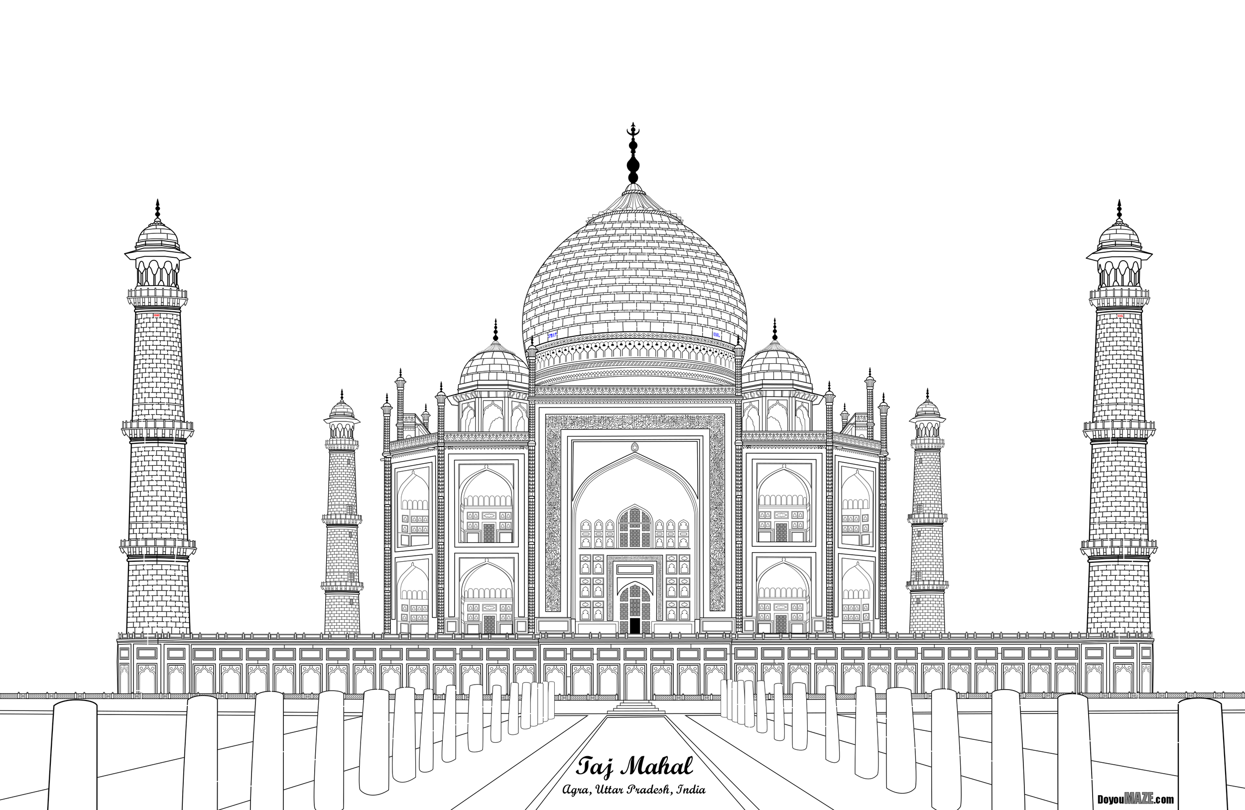
In my first 7 case studies I took half finished mazes or completed mazes that weren’t very good and improved them. Case study #8 looked at adding color to mazes that were previously black in and white. If you want to read those case studies the links are at the end of the post. Today I want to take you through a maze I was happy with, but still thought it could be improved and challenged myself to do the slow work of improving it.
My thought was, if you are going to make a maze of something iconic, make the best version of it you can. Basically, I think this Taj Mahal maze deserves the extra attention to detail needed to make it better.
And let’s look at that original maze, also known as the ‘before’:
Taj Mahal Maze in black and white
The maze is black and white, and even when solving it on a screen you cannot see all the details I added. It needs to be printed very large (poster size) to get the full effect. It actually includes 2 mazes - the first between the 2 farthest towers and the second located in the center dome. Let’s see what I did to improve it.
And here are the changes I made to (hopefully) improve the maze:
1. Color - Even though the Taj Mahal is basically white, it is 2 slightly different shades. An off white and a slighty browner white for the 3 central domes. The background sky in blue help the building pop more. The bushes and grass and water also give the maze more interest.
2. Points - The points on top of the domes are mostly a gold color (when clean). They were changed.
3. Spaces - The open spaces at the top of 6 domes were colored to correctly show the sky behind and given shadows to give the space more shape.
4. Railing - The front railing is a pinkish color includes an ornamental design that includes holes that can be seen through. They were colored based on what is behind them (either the sky or the Taj Mahal)
5. Front Steps - I did not have a good picture of the front steps before. With some research I changed the design to be a more accurate presentation of what is actually there !
6. Arch design - Above the center arch (previously blank) I added a colorful design of flowers and vines based on new picture I found. I also added this to above the 8 side arches.
7. Minor Fixes - When I color a maze I see some details I miss along the way which I fixed.
And now the “After”. The new maze:
I think this is an improvement. What do you think ? I may keep working on it We’ll see.
If you want to read the previous 7 case studies:
Case Study#1 - How to Improve a Bad Maze - Tiki Totem Maze
Case Study#2 - How to Improve a Bad Maze - Danzante Conchero Chichimeca Maze
Case Study#3 - How to Improve a Bad Maze - Red Rocks Amphitheatre Maze
Case Study#4 - How to Improve a Bad Maze - The Hollywood Sign
Case Study#5 - How to Improve a Bad Maze - Severance Hall
Case Study#6 - How to Improve a Maze - Uxmal


