Case Study#10 - Improving a Maze - Templo de Sangre de Cristo

Welcome back for another case study. Case study #8 (all case study links are below) looked at adding color to 6 mazes that were previously black in and white. Case study #9 went into a larger re-vamp of the Taj Mahal. Today in Case Study #10 I will take you through the re-imagining of the maze of Templo de Sangre de Cristo. It was one of my favorite mazes but I knew I could make it better.

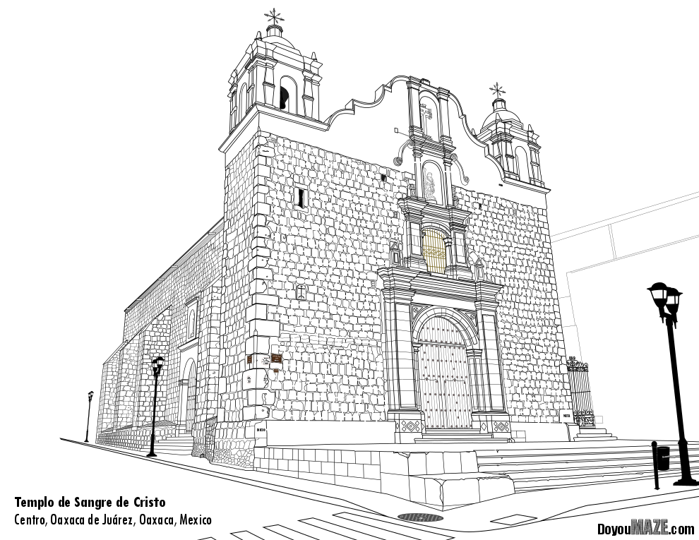
Let’s look at that original maze, also known as the ‘before’:

Templo de Sangre de Cristo laberinto in black and white

Templo de Sangre de Cristo in black and white

I put a lot of detail into this maze. I went back to the site and took many pictures to catch as many details as I could.

And here are the changes I made to (hopefully) improve the maze:

1. Color - I added color everywhere. I even did the far wall of the building next door (the church is set back from the street while the next door building is not). I added a clear blue sky.

2. Stones - The church is made of stones that are a variety of colors as some have been replaced over the years. I picked about 30 stones which had the largest color differences, mostly on the corners, and made them accurate. I declined to do every stone a different color.

3. Shadows - The shadows on this church really set it apart. There is a ridge on the left side of the building that always has a shadow on it - might look weird, but I assure you it is accurate !

4. Minor Fixes - When I color a maze I see some details I miss along the way which I fixed.

And now the “After”. The new maze:

Laberinto del Templo de Sangre de Cristo en color

Case Study#9 - Improving a Maze - Taj Mahal

In my first 7 case studies I took half finished mazes or completed mazes that weren’t very good and improved them. Case study #8 looked at adding color to mazes that were previously black in and white. If you want to read those case studies the links are at the end of the post. Today I want to take you through a maze I was happy with, but still thought it could be improved and challenged myself to do the slow work of improving it.

My thought was, if you are going to make a maze of something iconic, make the best version of it you can. Basically, I think this Taj Mahal maze deserves the extra attention to detail needed to make it better.

And let’s look at that original maze, also known as the ‘before’:

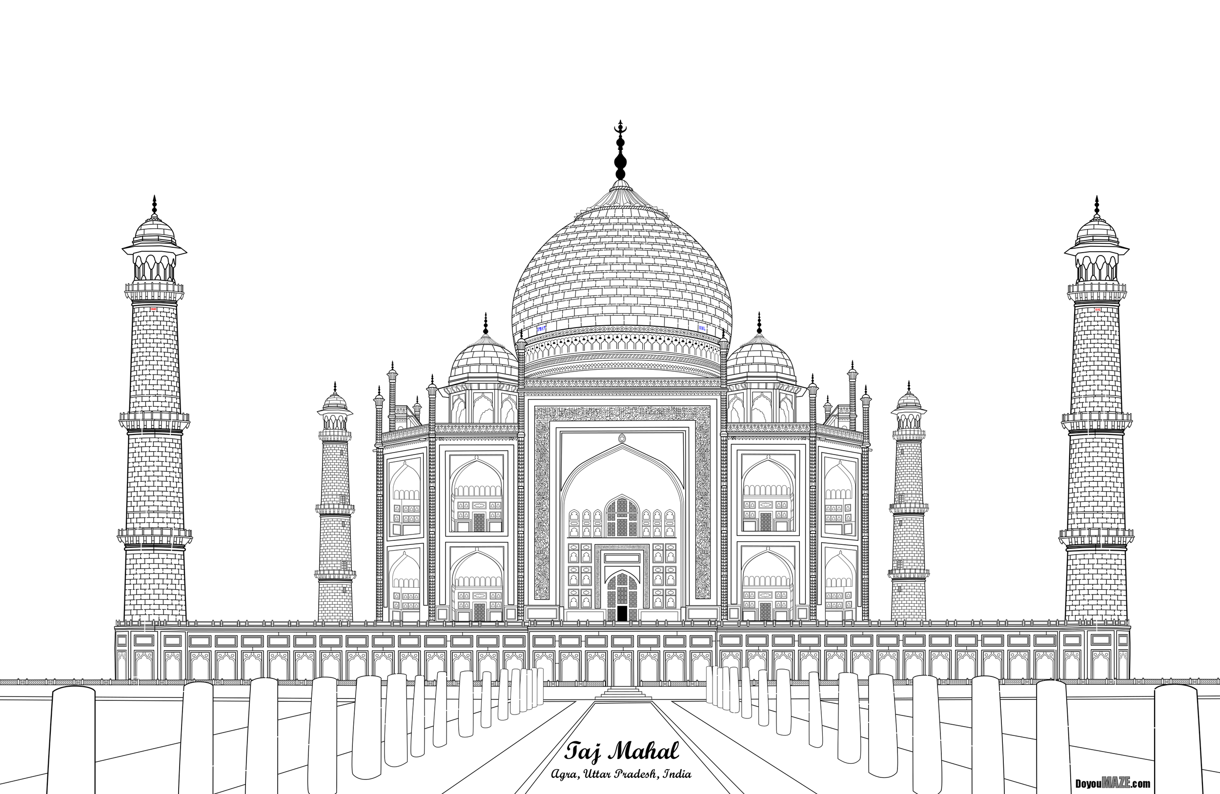
Taj Mahal Maze in black and white

Taj Mahal Maze in black and white

The maze is black and white, and even when solving it on a screen you cannot see all the details I added. It needs to be printed very large (poster size) to get the full effect. It actually includes 2 mazes - the first between the 2 farthest towers and the second located in the center dome. Let’s see what I did to improve it.

And here are the changes I made to (hopefully) improve the maze:

1. Color - Even though the Taj Mahal is basically white, it is 2 slightly different shades. An off white and a slighty browner white for the 3 central domes. The background sky in blue help the building pop more. The bushes and grass and water also give the maze more interest.

2. Points - The points on top of the domes are mostly a gold color (when clean). They were changed.

3. Spaces - The open spaces at the top of 6 domes were colored to correctly show the sky behind and given shadows to give the space more shape.

4. Railing - The front railing is a pinkish color includes an ornamental design that includes holes that can be seen through. They were colored based on what is behind them (either the sky or the Taj Mahal)

5. Front Steps - I did not have a good picture of the front steps before. With some research I changed the design to be a more accurate presentation of what is actually there !

6. Arch design - Above the center arch (previously blank) I added a colorful design of flowers and vines based on new picture I found. I also added this to above the 8 side arches.

7. Minor Fixes - When I color a maze I see some details I miss along the way which I fixed.

And now the “After”. The new maze:

Taj Mahal full color Maze

Case Study#8 - Improving Previous Mazes

In my first 7 case studies I took half finished mazes or completed mazes that weren’t very good and improved them. If you want to read those case studies the links are at the end of the post. Today I want to take you through a series of mazes I was happy with, but still thought it could be improved and challenged myself to do the slow work of improving it.

I asked a friend for some feedback and they thought every color maze was better than every black and white maze, with only a few exceptions. My thought was, let’s take the time to color a few mazes of the week from this week and see if color improves them or not. I ended up doing 9 different mazes, with 2 getting a lot of extra attention. Today we look at 7 of the mazes.

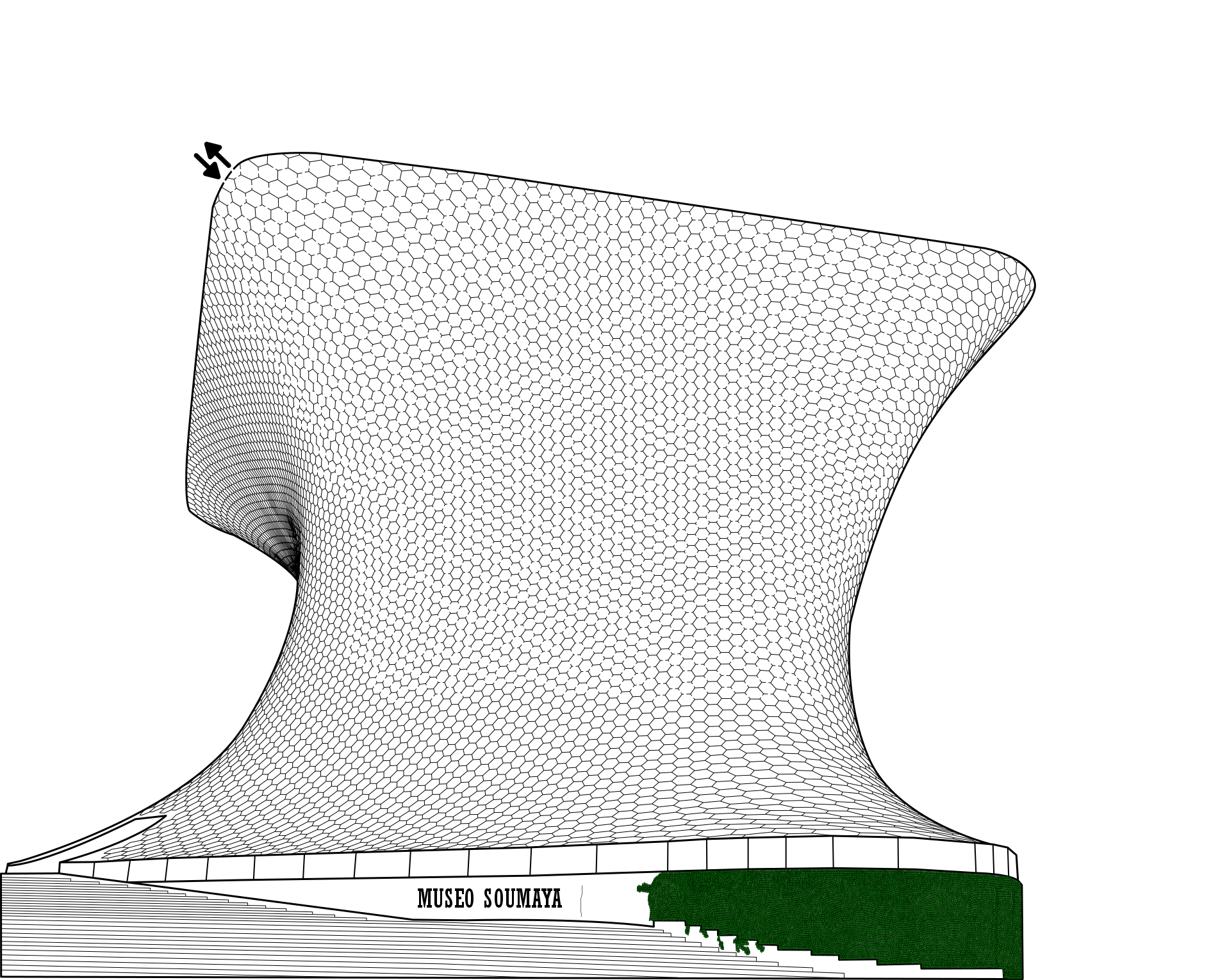
Museo Soumaya Maze

Let’s look at that original maze, also known as the ‘before’:

Museo Soumaya Maze black and white

The building has a unique shape, and while it is a black and white maze I did give the leaves that cover the front color so people could see what it was. The revised maze:

Museo Soumaya Maze in color

Some simple coloring, but shadows give the building more shape. I think this is a slight improvement !

Heydar Aliyev Center Maze

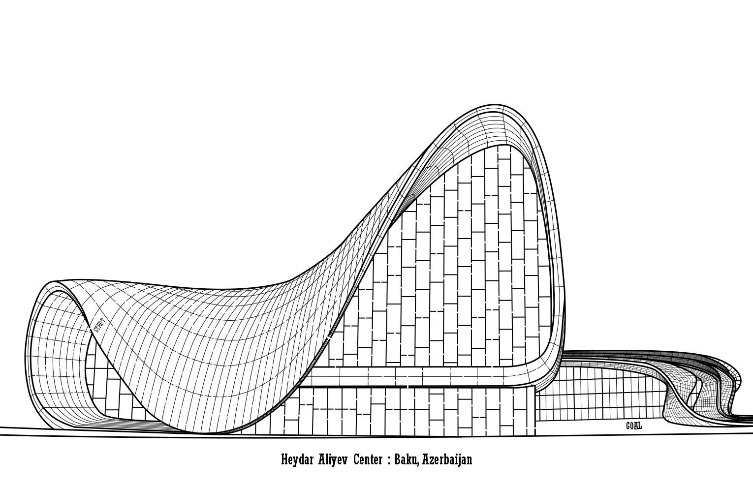
A beautiful white building seemed natural to stay black and white.

Heydar Aliyev Center Maze black and white

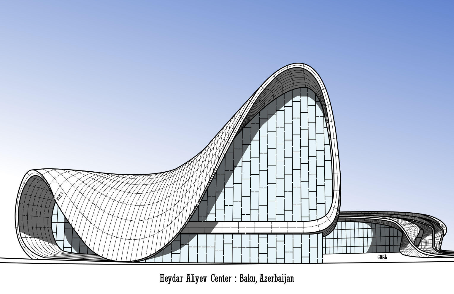
But in the revision I added a blue sky that helps to pop the white building more, and added shadows to give the unique building more shape on the page. Personally, I think these minor changes make the maze much better !

Heydar Aliyev Center Maze in color

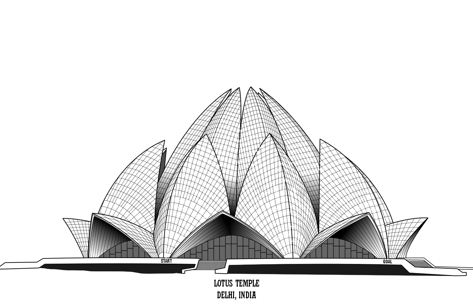
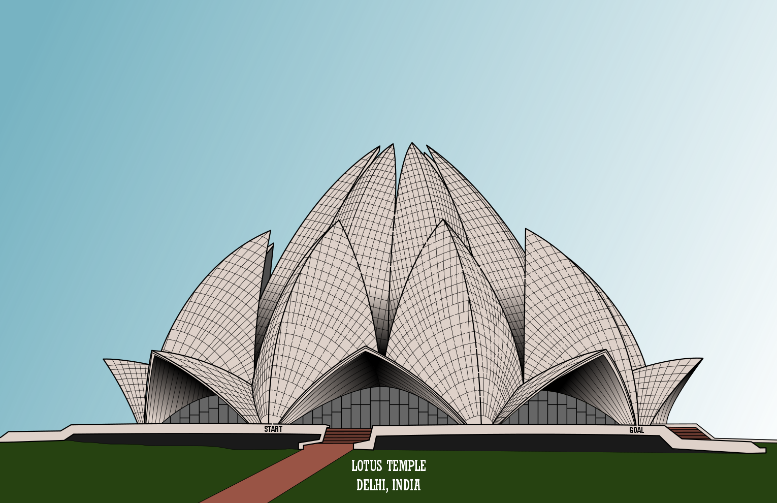
Lotus Temple Maze
This is another building that is an off white color so I left it in greyscale. I did originally add shadows to the maze to show the unique shape, and that really worked.

Lotus Temple Maze

For the revision I added a sky, an expanded pathway and grasses. I’m not sure if this is an improvement. I think I prefer the original.

Lotus Temple Maze in color

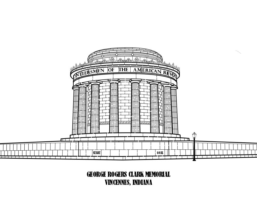
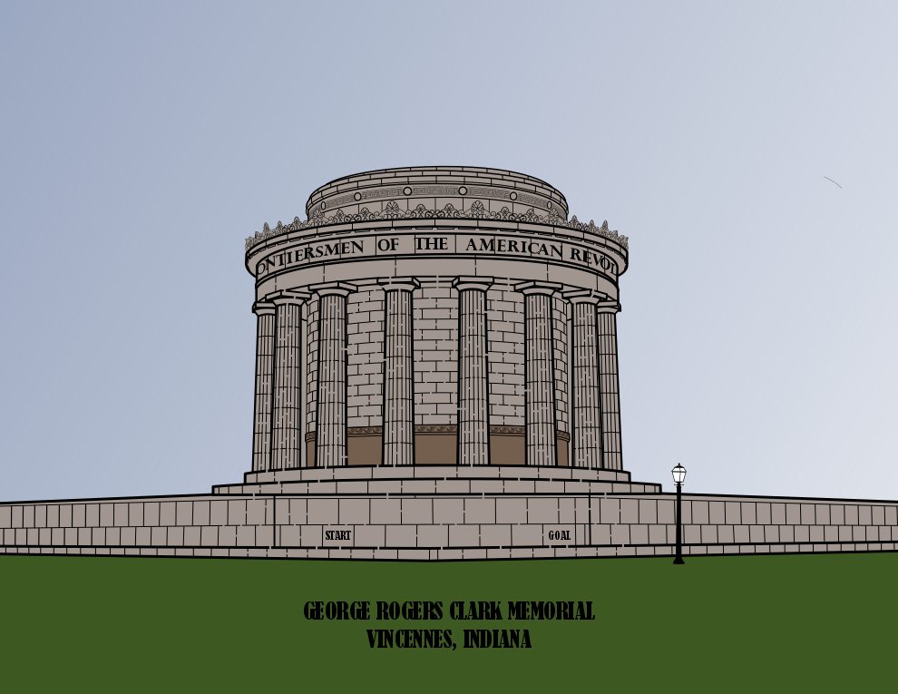
George Rogers Clark Memorial Maze
This was a random maze I made because I liked the building. I also liked how it looked in black and white.

George Rogers Clark Memorial Maze in black and white

The revision only includes 4 colors and gives you a better feeling of what the building actually looks like. Either maze is ok for me. I considered shadows…but no.

George Rogers Clark Memorial Maze in color

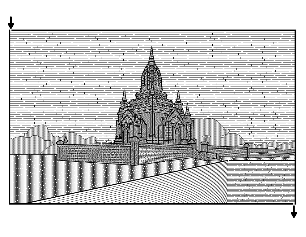
Bagan Temple Maze
I did this maze off of a photo I took and used a different technique of drawing different spaced and thickness lines to make it. I generally do not use this technique anymore. I also no longer “maze” the sky.

Bagan Temple Maze

Adding color inside the frame makes this look different, almost like a postcard. I think I prefer the original, but in color it is ok.

Bagan Temple Maze in color

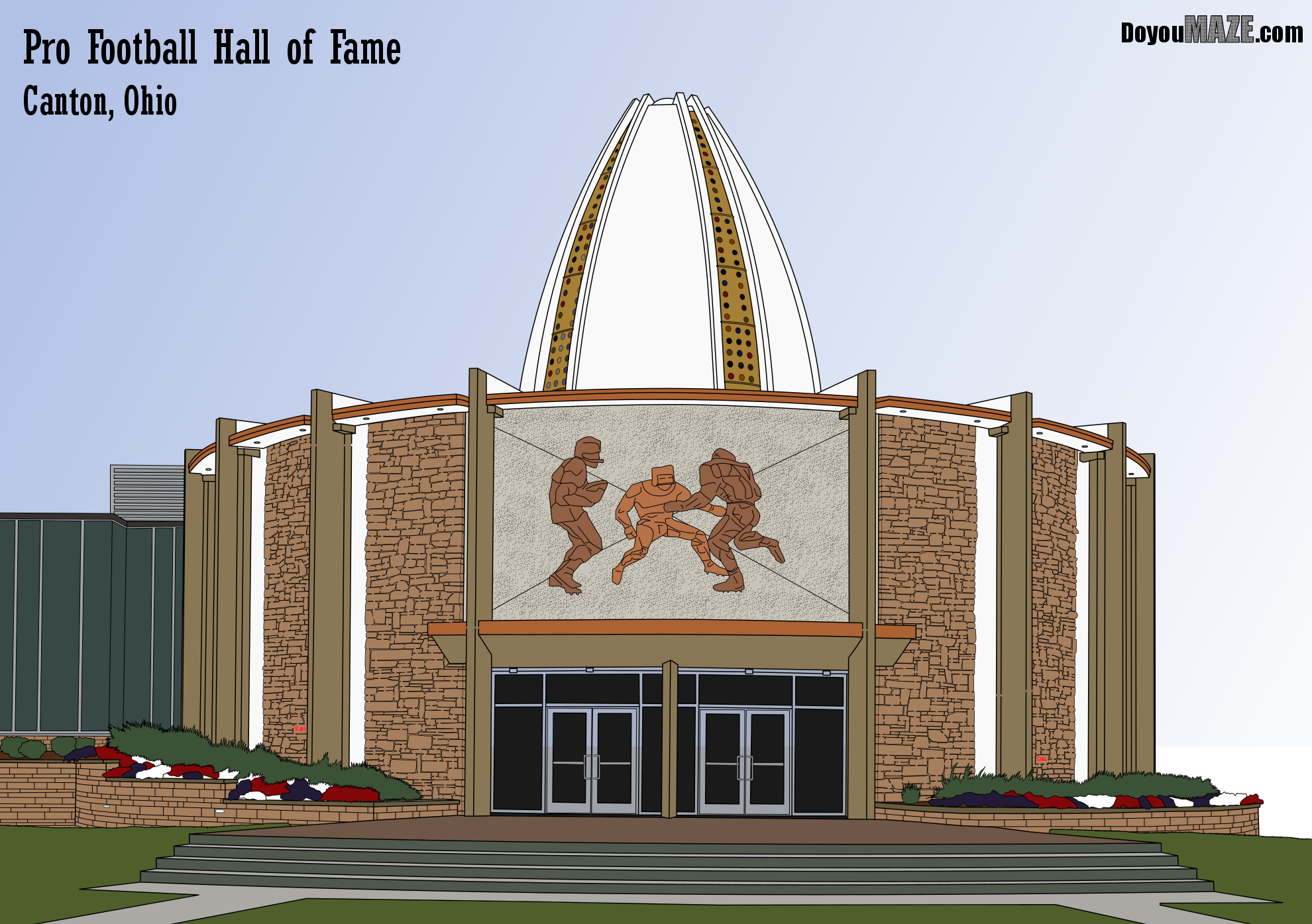
Pro Football Hall of Fame Maze

I always knew this should be in color. The stones on the building are multicolored. I have done individual brick/stone colors before and it is tedious.

Pro Football HOF maze black and white

But I think the addition of color, especially with the plants in front and the small windows on the football roof make this much better in color (even if I went with one brown for the stones).

Pro Football HOF maze in color

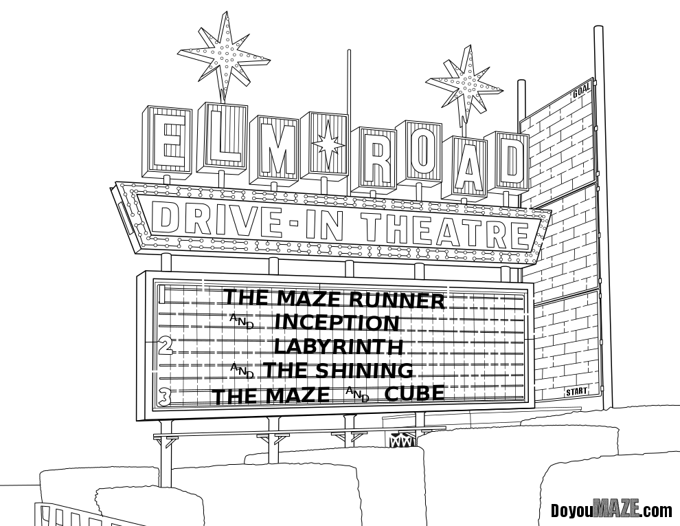
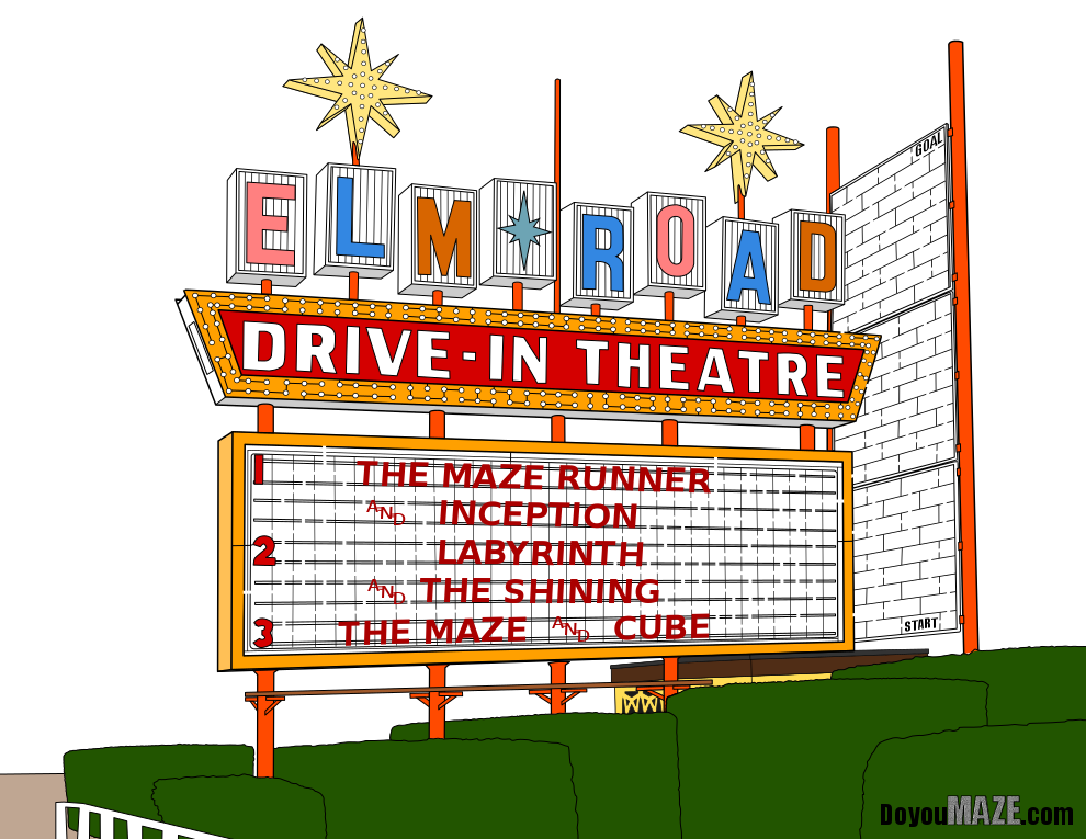
Elm Road Theater Sign

This weeks maze was a last minute switch ! Here is the original.

Elm Road Drive In Theatre Sign Maze

And here is the much more colorful version! I like both, but the colors really pop and give you a better sense of what the drive in sign looks like !

Elm Road Drive In Theatre Sign Maze in color

So that concludes this case study…some mazes look better in color, while others do not. Overall adding color is a good thing thought because when it works, it really works. So that was 7 mazes of the 9 I colored. The other 2 mazes get their own case studies (#9 and #10) because I did more work on them, and have more to discuss besides a before and after. Also, they look great (IMO) so stop by soon and read about them !

If you want to read the previous 7 case studies:

Case Study#1 - How to Improve a Bad Maze - Tiki Totem Maze

Case Study#2 - How to Improve a Bad Maze - Danzante Conchero Chichimeca Maze

Case Study#3 - How to Improve a Bad Maze - Red Rocks Amphitheatre Maze

Case Study#4 - How to Improve a Bad Maze - The Hollywood Sign

Case Study #5 - How to Improve a Bad Maze - Severance Hall

Case Study#6 - How to Improve a Maze - Uxmal

Case Study#7 - How to Improve a Bad Maze - Ship

Case Study#7 - How to Improve a Bad Maze - Ship
I have written 2 blog posts featuring a total of 20 mazes that I abandoned for one reason or another. You can read them here:

Why I abandoned these 10 mazes - Mistakes in Maze making

10 More Abandoned Mazes - Mistakes in Maze Making

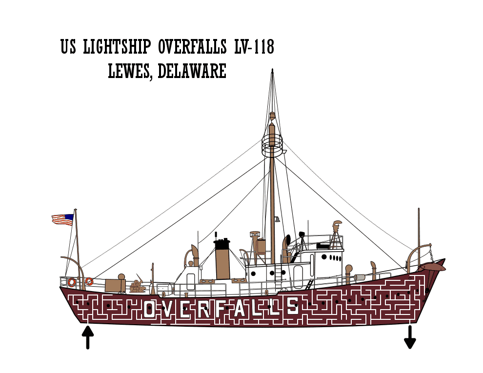
I took the time to evaluate the mazes and see why they did not work and try to determine - could they be salvaged ? Today I present a case study (my 7th) for improving one of those mazes, The US Lightship Overfalls LV-118. Here is my analysis from the previous blog:

“Abandoned Maze #6 - US Lightship Maze

I spent a lot of time on the details of this boat. I wanted to make it for Veteran’s Day. The only place to make the maze is in the hull of the boat and I used an on-line construction. It just doesn’t look good. It might be salvageable. Mistake made: Poor maze construction.”

And let’s look at that maze, also known as the ‘before’:

And here are the changes I made to (hopefully) improve the maze:

1. Color - Changed the color of yellow - brighter to better reflect actual color and pop the picture more. I missed 2 - honestly I do not know the name of them - but they are on the side of the boat, one in the front and one in the back, anyway I colored them red. I basically cleaned up small items that needed color. I added a bit of shadows also.

2. Shoreline added - The boat appears to be floating in a white of nothingness. It isn’t terrible but I felt it would be improved with some context. I decided to do the shoreline vs. out on the water. This includes grass and a chain fence connecting black moorings. I hooked-the boat up also.

3. Hull addition - When I was exploring the location I would use for the boat I decided to add the addition hull that is black (sometimes under the water depending on the weight of the ship’s holdings). This also includes the markings showing how deep the boat is into the water on the front in white - a fun detail.

4. Sky addition - The white sky feels like empty space. Might as well finish the color.

5. Recolor the Deck - If the actual deck is not white, it is an off-white color. I think changing it to a light grey color helps give the ship more shape.

6. Re-Letter and brand - Change the font size of the lettering to reflect the smaller size layout and add my branding to the top right corner.

7. Change the maze size - Not essential. But I am starting to make more mazes that do not fit a traditional size piece of paper. I thought that this helps to showcase the maze and subject matter more than the sky

8. Details - I kept adding details as I went along. The more I added the more I wanted to add. A light, some door accessories. Another line to the shore. So many small things that are part of the picture but have no bearing on the actual maze. To be honest, I could spend a few more hours adding even more details but I decided to stop to work on the actual maze.

9. New Maze - The original on-line white color version didn’t work. With the shoreline added I decided to switch from start and goal arrows to a internal lettered Start and Goal. I tried a freehand drawn maze in black to see how it looked…and I think it looks better. The black looks better on the slightly brighter colored boat.

And now the “After”. The new maze:

US Lightship Overfalls LV-118 Maze