I have written 2 blog posts featuring a total of 20 mazes that I abandoned for one reason or another. You can read them here:
Why I abandoned these 10 mazes - Mistakes in Maze making
10 More Abandoned Mazes - Mistakes in Maze Making
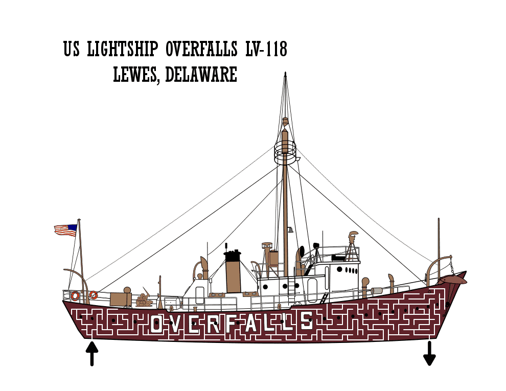
I took the time to evaluate the mazes and see why they did not work and try to determine - could they be salvaged ? Today I present a case study (my 7th) for improving one of those mazes, The US Lightship Overfalls LV-118. Here is my analysis from the previous blog:
“Abandoned Maze #6 - US Lightship Maze
I spent a lot of time on the details of this boat. I wanted to make it for Veteran’s Day. The only place to make the maze is in the hull of the boat and I used an on-line construction. It just doesn’t look good. It might be salvageable. Mistake made: Poor maze construction.”
And let’s look at that maze, also known as the ‘before’:
And here are the changes I made to (hopefully) improve the maze:
1. Color - Changed the color of yellow - brighter to better reflect actual color and pop the picture more. I missed 2 - honestly I do not know the name of them - but they are on the side of the boat, one in the front and one in the back, anyway I colored them red. I basically cleaned up small items that needed color. I added a bit of shadows also.
2. Shoreline added - The boat appears to be floating in a white of nothingness. It isn’t terrible but I felt it would be improved with some context. I decided to do the shoreline vs. out on the water. This includes grass and a chain fence connecting black moorings. I hooked-the boat up also.
3. Hull addition - When I was exploring the location I would use for the boat I decided to add the addition hull that is black (sometimes under the water depending on the weight of the ship’s holdings). This also includes the markings showing how deep the boat is into the water on the front in white - a fun detail.
4. Sky addition - The white sky feels like empty space. Might as well finish the color.
5. Recolor the Deck - If the actual deck is not white, it is an off-white color. I think changing it to a light grey color helps give the ship more shape.
6. Re-Letter and brand - Change the font size of the lettering to reflect the smaller size layout and add my branding to the top right corner.
7. Change the maze size - Not essential. But I am starting to make more mazes that do not fit a traditional size piece of paper. I thought that this helps to showcase the maze and subject matter more than the sky
8. Details - I kept adding details as I went along. The more I added the more I wanted to add. A light, some door accessories. Another line to the shore. So many small things that are part of the picture but have no bearing on the actual maze. To be honest, I could spend a few more hours adding even more details but I decided to stop to work on the actual maze.
9. New Maze - The original on-line white color version didn’t work. With the shoreline added I decided to switch from start and goal arrows to a internal lettered Start and Goal. I tried a freehand drawn maze in black to see how it looked…and I think it looks better. The black looks better on the slightly brighter colored boat.
And now the “After”. The new maze:
I think this is an improvement. What do you think ? Should I have added more details ?
If you want to read the previous 6 case studies:
Case Study#1 - How to Improve a Bad Maze - Tiki Totem Maze
Case Study#2 - How to Improve a Bad Maze - Danzante Conchero Chichimeca Maze
Case Study#3 - How to Improve a Bad Maze - Red Rocks Amphitheatre Maze
Case Study#4 - How to Improve a Bad Maze - The Hollywood Sign


